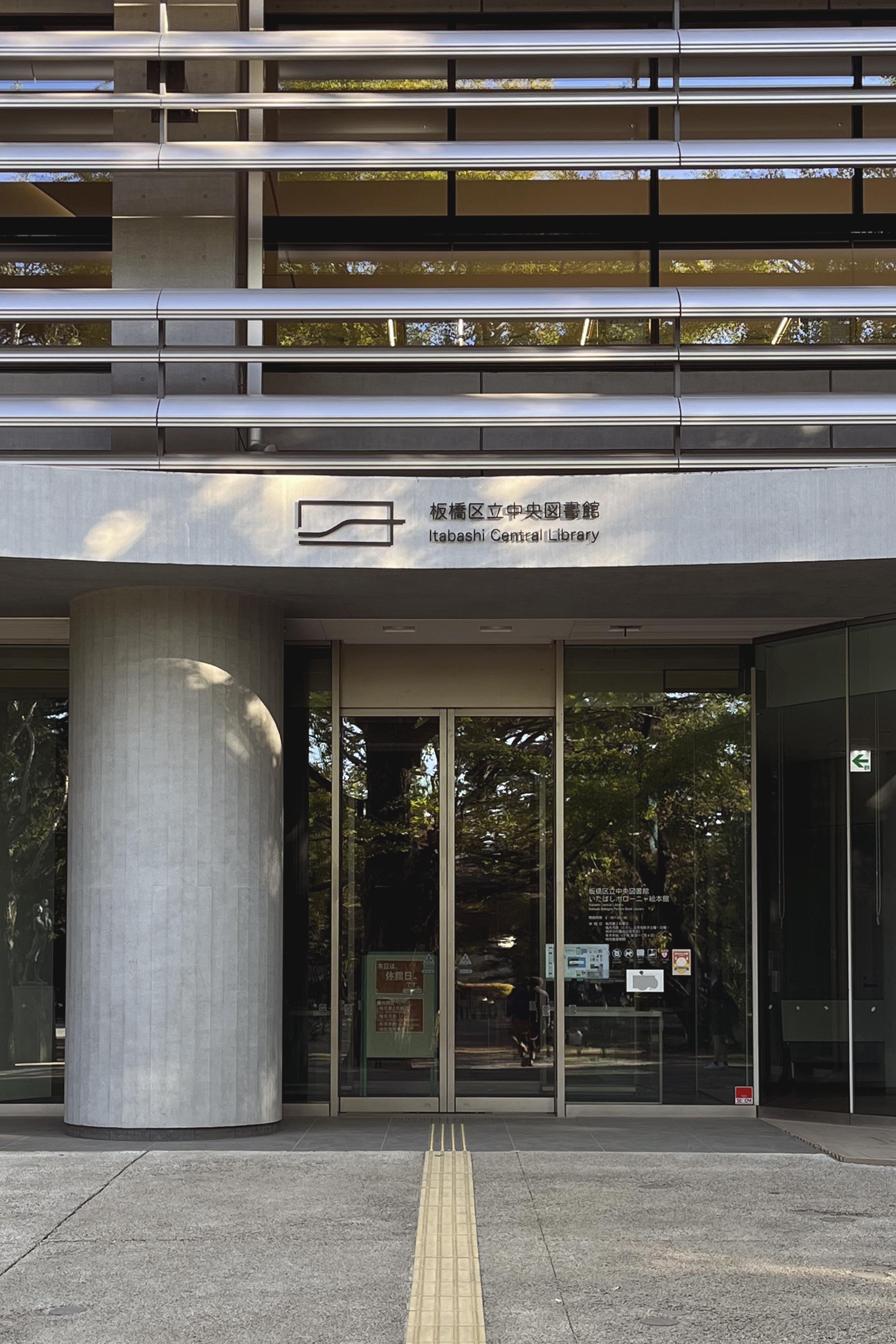
For this competition we were awarded first prize. It concerns the design of a permanent space dedicated to the city of Bologna within the new public Library
of the city of Itabashi (Tokyo), twin city with Bologna.
The proposal is based on some of Bolognas most evident characteristics. Together they form a coalition that constitutes this project. These characteristics are arcades, warm colours, wooden columns, painted ceilings and green terraces.
Beams and painted ceilings: The beams carrying the second level form a cassette ceiling “under the arcade”. It is common in Bologna that the ceilings under the arcades are painted, sometimes in a simple manner and other times with the most intricate paintings from different epochs. In reference to this each cassette in the ceiling has been painted with a cherry flower in order to represent both Bologna and Itabashi in this element. For example referencing the Shakujiigawa River running through Itabashi which is lined with cherry trees.
Green terraces: Bologna is dense, but still feels green. Something that assists this feeling are the terraces from which lush greenery falls into the streetscape.
The upper level of this proposal is referencing these terraces with lemon and orange plants contained in pots to remain mobile, visible from the floor of the Children's’ Book Hall. This creates a nice atmosphere while interacting with the structure but is also making a connection to the green park that the library is situated in. This level has books for older children as it is reached via the stair. The ground floor is directed to smaller children where parents and librarians can have a total overview.
Arcades: The most obvious and characteristic trait of Bologna are the arcades/porticos. With its 40 km of arcades it is an inevitable symbol of the city. The arcades create shelter and safety for pedestrians as well as allowing activity to take place on the street in a more intense way.
The project has thus been outlined with an arcade all around representing the never-ending arcades and allows full visibility through promoting safety for the children and overview for the adults/library workers at the same time as it is inviting play and discovery.
A warm colour: Bologna’s city center has an unmistakable aesthetic, partly with the aid of the unity in colours spanning from yellow to earthy reds and pinks.
To reference these colours and to create a happy, warm and inviting structure a pink tone has been chosen to clad the structure.
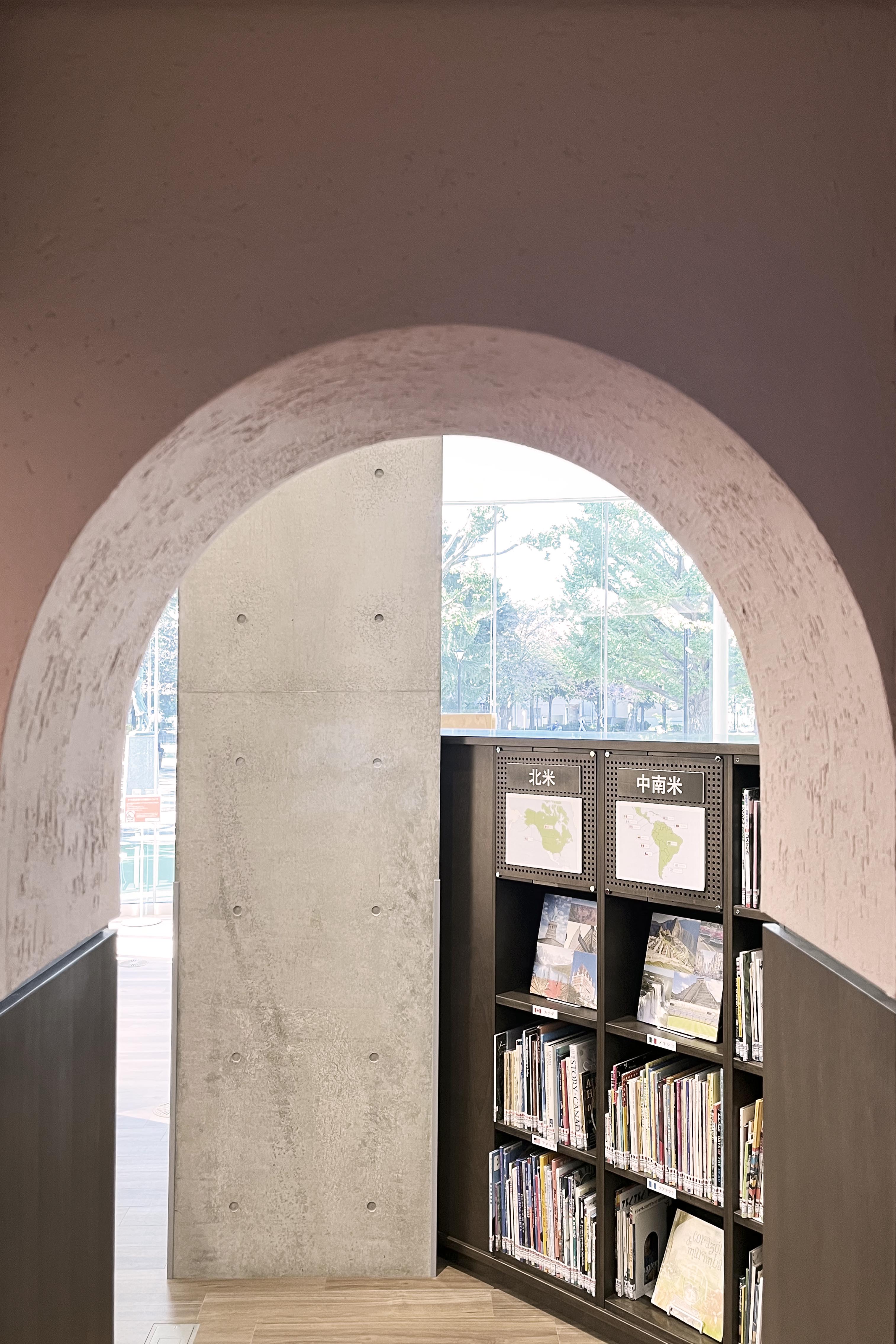
Wooden pillars: Some of Bologna’s most famous arcades and iconic buildings are the older ones which present themselves with their wooden pillars and wooden ceilings.
For this reason wood has been chosen as the load-bearing material, with a wink to vernacular wooden Japanese architecture. The four corner columns are carrying the structure while the remaining eight dividing the arcades are in fact bookshelves, visibile from the inside of the arcade. This element is partly to create a coherence in the facade of the structure but also to add an element of humour and discovery to stimulate the children.
![]()
![]()
![]()
![]()
![]()
![]()
![]()
![]()